The news business is rarely funny. Much of what we do every day is report on devastating acts of nature, the plight of those without voices – the problems of the world. For most of those stories it’s best to rely on the Joe Friday approach: just the facts, which almost always speak louder than any adjective you could throw at them. But sometimes it’s good to find an interesting story and tell it in a funny way. Here, video can really shine.
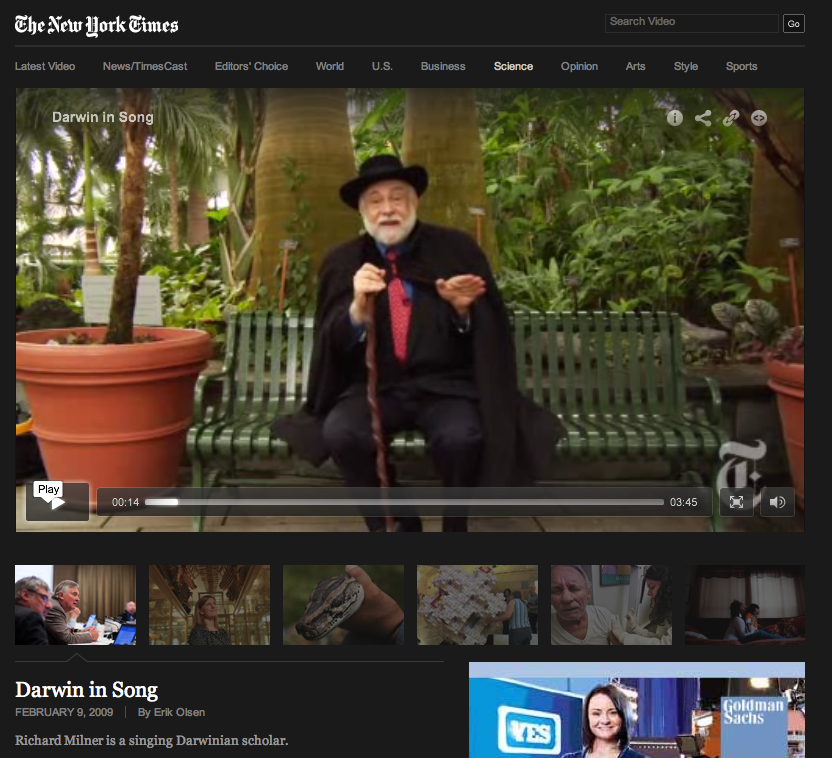
 A few examples: Myles Kane's video of Apollo Robbins deftly lifting New Yorker writer Adam Green’s wallet, watch and cell phone; my New York Times colleague Erik Olsen’s profile of a singing ode to Charles Darwin; the weird wonders of the miracle fruit, which I made with another colleague, Kassie Bracken, who expertly edited and found the wonderful loopy music.
Video, with its ability to engage ears, eyes and brains in layers unavailable in any other format, is a perfect way to ply the humorous news trade. Suddenly music, sound effects, visual gags and surprises are tools to enliven a story in ways print alone can’t manage.
Take a close look at this piece by my colleagues Zena Barakat, Emily S. Rueb and Natalia V. Osipova: The Subway Shuffle ran with a short blog post by Matt Flegenheimer about the daily dance of the New York City subway rider. Sure, it’s not breaking news, but it’s the kind of bright little piece that can bring a bit of joy to the viewer. The video, with the classic score of cartoon business (“Flight of the Bumblebee,” by Rimsky-Korsikov), the sped-up footage reminiscent of early cinema, and the authoritatively bemused narration create something that could never be replicated on the page. Quite funny.
The producers could have put this video together any number of ways. The classic news approach would have been interviews with frustrated riders, standard speed footage of doors opening and closing, an interview with a Metropolitan Transit Authority representative. The problem is that then you’ve got a video a bit too much like every other piece. You’ve followed the rules of how to report the news.
Instead, this playful video breaks with convention and keeps your interest.
Granted, this is a light piece, but the same techniques can be used for heavier material. I talked with Robert Krulwich, who may be best known these days as one half of the Radiolab duo. (The other half is Jad Abumrad.) Krulwish is a veteran of multiple media, having worked as a print reporter, in TV and on radio – and is an entertaining blogger. He’s a master, in my opinion, of taking often complex, even deadly dry information and making it palatable, interesting and often funny. Take a look at this NOVA scienceNOW special he did on hydrogen fuel cells:
My favorite part is the section where he enlists Tom and Ray Magliozzi, better known as “Click and Clack” of NPR’s Car Talk, to don hydrogen atom suits made of Lycra and crawl around on a tennis court to explain how exactly a fuel cell works. I asked Krulwich how he comes up with these scenarios and he swears that he’s not necessarily trying to be funny. “I think I’m always a slow processor and it takes me a while to understand things,” he said. “I fall into a conversation with myself about what I just heard.”
There’s an old broadcast interviewing trick for difficult subject matter, especially when searching for that pithy sound bite or quick quote. It usually goes like this: “Can you explain this to me as if I was a 4-year old?” Krulwich says his approach is simply to become the 4-year old.
The result is what he’s become known for: an ability to pull the record of scientific information to a screeching stop and ask the researcher point-blank, “Are you telling me that I share 50 percent of my DNA with a banana?”
Consequently, his work doesn’t fall into the usual patter of news speak. Jokes, humorous asides and visual gags fill his videos and he plays with timing in ways that the best comedians do. On the radio he and Abumrad bop and weave sonically. All of that adds up to something you haven’t heard or seen before. The jokes, Krulwich says, make the ideas “sticky and true, sticky in the sense that it sticks in your mind and true because they are facts.”
For the NOVA piece, Krulwich and his producers could have ordered up a slick animation of hydrogen and oxygen molecules and their electrons to explain how a fuel cell works, but the absurdity of three grown men in Lycra outfits with balloons taped to their rear ends crawling around on a tennis court is so much funnier and more memorable. Krulwich says that kind of disruption of the usual narrative drone of so many nature or news programs, “keeps you watching because you don’t know what the next beat is going to be. You’re afraid you might miss something.”
Radiolab has expanded this idea into its animated explainer videos, which have become something of a web video specialty. I spoke with Carrie Ching, a senior multimedia producer at the Center for Investigative Reporting about two projects she’s worked on that take data on fairly dry and complex material – the production of oil and the beef supply chain – and weave the findings into entertaining animated films that zip through reams of otherwise eye-glazing statistics. “Carbon footprints are really hard to visualize,” says Ching. “This is stuff you can’t see: gases. That’s why we took the animated route. It was complicated but if told the right way everyone could relate."
The animated pieces, “The Price of Gas” and “The Hidden Cost of Hamburgers,” Ching says, are among the most-watched videos CIR has produced, and it’s easy to see why. Cartoon cars and flatulent cows pull the audience along in a way that a PowerPoint slide never could. Like Krulwich, Ching has found that humor helps information soak in.
So why don’t more video journalists use humor in their work? Not everyone is ready to take on a jocular tone or haul out the sound effects library. “I think a lot of journalists are uncomfortable using humor – it’s too much personality,” says Ching. “We’re trained in so much objectivity. But people actually respond more when you show some personality.”
The inspiration for her videos was “The Story of Stuff,” a similar explainer video that explores where and how most of our things are produced, used and discarded. These are sharable videos with viral potential. Morgan Spurlock’s documentary film Supersize Me also managed to be funny even while plowing through numbers and health information, often with animations, zippy music and comical drawings.
Not all of us have the resources to commission cartoons or hire well-known radio personalities to dress up for our videos, but I do think that given the right story, the funny route can be the right one. I queried Krulwich again for a ruling on when to break out the clown nose: He says he lets the material dictate the tone:
Give it a try. Maybe you’ve got a video story brewing about the problem of potholes in your town. Could it be good candidate for a light touch, a bit of fun with the editing to report on a related bond measure in the city council? I don’t know about you, but I’d sure click on that video 10 times faster than I’d watch a clip of a city council meeting.
 Sean Patrick Farrell (@spatrickfarrell) is a staff video journalist at the New York Times and writes the Viewfinder column for Storyboard. He has made videos about tracking wolverines in Montana, dangerous medical radiation and aspiring young opera singers, among many others. He is a graduate of the University of California, Berkeley’s Graduate School of Journalism, where he studied documentary film. Before becoming a journalist, he spent a decade working as a bicycle mechanic. You can find more of his work at www.seanpatrickfarrell.com.
A few examples: Myles Kane's video of Apollo Robbins deftly lifting New Yorker writer Adam Green’s wallet, watch and cell phone; my New York Times colleague Erik Olsen’s profile of a singing ode to Charles Darwin; the weird wonders of the miracle fruit, which I made with another colleague, Kassie Bracken, who expertly edited and found the wonderful loopy music.Video, with its ability to engage ears, eyes and brains in layers unavailable in any other format, is a perfect way to ply the humorous news trade. Suddenly music, sound effects, visual gags and surprises are tools to enliven a story in ways print alone can’t manage.
Take a close look at this piece by my colleagues Zena Barakat, Emily S. Rueb and Natalia V. Osipova: The Subway Shuffle ran with a short blog post by Matt Flegenheimer about the daily dance of the New York City subway rider. Sure, it’s not breaking news, but it’s the kind of bright little piece that can bring a bit of joy to the viewer. The video, with the classic score of cartoon business (“Flight of the Bumblebee,” by Rimsky-Korsikov), the sped-up footage reminiscent of early cinema, and the authoritatively bemused narration create something that could never be replicated on the page. Quite funny.
The producers could have put this video together any number of ways. The classic news approach would have been interviews with frustrated riders, standard speed footage of doors opening and closing, an interview with a Metropolitan Transit Authority representative. The problem is that then you’ve got a video a bit too much like every other piece. You’ve followed the rules of how to report the news.
Instead, this playful video breaks with convention and keeps your interest.
Granted, this is a light piece, but the same techniques can be used for heavier material. I talked with Robert Krulwich, who may be best known these days as one half of the Radiolab duo. (The other half is Jad Abumrad.) Krulwish is a veteran of multiple media, having worked as a print reporter, in TV and on radio – and is an entertaining blogger. He’s a master, in my opinion, of taking often complex, even deadly dry information and making it palatable, interesting and often funny. Take a look at this NOVA scienceNOW special he did on hydrogen fuel cells:
My favorite part is the section where he enlists Tom and Ray Magliozzi, better known as “Click and Clack” of NPR’s Car Talk, to don hydrogen atom suits made of Lycra and crawl around on a tennis court to explain how exactly a fuel cell works. I asked Krulwich how he comes up with these scenarios and he swears that he’s not necessarily trying to be funny. “I think I’m always a slow processor and it takes me a while to understand things,” he said. “I fall into a conversation with myself about what I just heard.”
There’s an old broadcast interviewing trick for difficult subject matter, especially when searching for that pithy sound bite or quick quote. It usually goes like this: “Can you explain this to me as if I was a 4-year old?” Krulwich says his approach is simply to become the 4-year old.
The result is what he’s become known for: an ability to pull the record of scientific information to a screeching stop and ask the researcher point-blank, “Are you telling me that I share 50 percent of my DNA with a banana?”
Consequently, his work doesn’t fall into the usual patter of news speak. Jokes, humorous asides and visual gags fill his videos and he plays with timing in ways that the best comedians do. On the radio he and Abumrad bop and weave sonically. All of that adds up to something you haven’t heard or seen before. The jokes, Krulwich says, make the ideas “sticky and true, sticky in the sense that it sticks in your mind and true because they are facts.”
For the NOVA piece, Krulwich and his producers could have ordered up a slick animation of hydrogen and oxygen molecules and their electrons to explain how a fuel cell works, but the absurdity of three grown men in Lycra outfits with balloons taped to their rear ends crawling around on a tennis court is so much funnier and more memorable. Krulwich says that kind of disruption of the usual narrative drone of so many nature or news programs, “keeps you watching because you don’t know what the next beat is going to be. You’re afraid you might miss something.”
Radiolab has expanded this idea into its animated explainer videos, which have become something of a web video specialty. I spoke with Carrie Ching, a senior multimedia producer at the Center for Investigative Reporting about two projects she’s worked on that take data on fairly dry and complex material – the production of oil and the beef supply chain – and weave the findings into entertaining animated films that zip through reams of otherwise eye-glazing statistics. “Carbon footprints are really hard to visualize,” says Ching. “This is stuff you can’t see: gases. That’s why we took the animated route. It was complicated but if told the right way everyone could relate."
The animated pieces, “The Price of Gas” and “The Hidden Cost of Hamburgers,” Ching says, are among the most-watched videos CIR has produced, and it’s easy to see why. Cartoon cars and flatulent cows pull the audience along in a way that a PowerPoint slide never could. Like Krulwich, Ching has found that humor helps information soak in.
So why don’t more video journalists use humor in their work? Not everyone is ready to take on a jocular tone or haul out the sound effects library. “I think a lot of journalists are uncomfortable using humor – it’s too much personality,” says Ching. “We’re trained in so much objectivity. But people actually respond more when you show some personality.”
The inspiration for her videos was “The Story of Stuff,” a similar explainer video that explores where and how most of our things are produced, used and discarded. These are sharable videos with viral potential. Morgan Spurlock’s documentary film Supersize Me also managed to be funny even while plowing through numbers and health information, often with animations, zippy music and comical drawings.
Not all of us have the resources to commission cartoons or hire well-known radio personalities to dress up for our videos, but I do think that given the right story, the funny route can be the right one. I queried Krulwich again for a ruling on when to break out the clown nose: He says he lets the material dictate the tone:
We let the subject tell us. We never say, ‘Let’s be funny here’ because we need a break. You say to the topic, ‘What do you need?’
Give it a try. Maybe you’ve got a video story brewing about the problem of potholes in your town. Could it be good candidate for a light touch, a bit of fun with the editing to report on a related bond measure in the city council? I don’t know about you, but I’d sure click on that video 10 times faster than I’d watch a clip of a city council meeting.
Sean Patrick Farrell (@spatrickfarrell) is a staff video journalist at the New York Times and writes the Viewfinder column for Storyboard. He has made videos about tracking wolverines in Montana, dangerous medical radiation and aspiring young opera singers, among many others. He is a graduate of the University of California, Berkeley’s Graduate School of Journalism, where he studied documentary film. Before becoming a journalist, he spent a decade working as a bicycle mechanic. You can find more of his work at www.seanpatrickfarrell.com.